
I am going to assume that the purpose of this reading is going to be an analysis of the diagrams, stats, and data presented in the various Feltron Reports.
My first impression of viewing any one of the reports (I quickly went through a few) was that I had no idea what it was talking about. Take the following report as an example:
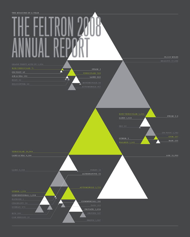
How Many Triangles Do You See?
First of all, what does the report cover? There is absolutely no explanation. It seems as though one half of the report contains information on Feltron’s play time (specifically how he travelled) in Grand Theft Auto IV, and the other reflects his real life travelling stats. But there’s several significant problems with these stats. First, what sort of measurements are we using? Is this miles, kilometers, meters? Are we actually not measuring distances at all? the first portion of numbers in the upper left under GTAIV gives a list of very small numbers, probably too small to be distances. Are they his kill count on the game? Could all the numbers on the infograph be number of kills racked up in a very prolific travelling year? Or, are we talking about the number of Doritos he ate while gaming or while travelling?

Maybe it’s a statistics on how many badgers gnawed on people’s faces while they were eating Doritos?
The answer to some of these questions may seem obvious – the majority of the report is probably the amount of travel Felton did over the course of a year. But this still brings up the all important question of measurement, and it doesn’t explain the upper left quadrant of numbers.
There’s also an issue with the format. The font of the statistics (the most important part of any infograph) is way too small. Then there are those bloody triangles. Does size denote importance of the statistic? How about color? Is there any significance to the way the triangles fall off eachother, always connecting to the left/right side of the bottom corners? These are just a few of the reasons why this infograph is abysmal. While Felton does continue his report and elaborate on these statistics, I still find it inexcusable that he doesn’t label is graphics better. Further, I’m having much more of a discussion on the content of graphically presented information verses the exact layout of his reports. Even if I were, I’d be probably even more critical. The front page does not do a good job explaining what the contents of the report will be and seems to lack sufficient resources to convey what Feltron will discuss. Everything I saw had to do with travel, sure, but very little of it had to do with things like total miles traveled. I saw nothing about GTAIV. It’s like a weak thesis statement which only says, “This paper will be discussing total distance traveled and random facts from my time playing GTA.” and yet the paper discusses much more than just total distance traveled and never gets around to talking about GTA.
The second Feltron report I read was the 2010 report.

An encapsulation of my confusion, as communicated by randomly drawn white lines
At least this one has a small caption at the bottom which makes this nonsensical web of lines, equipped with seemingly random allocations of geographic polities, have some symbolical meaning. Felton writes, “The 2010 Annual Report is an encapsulation of my father’s life, as communicated by the calendars, slides and other artifacts in my possession.” Once again, we’re faced with a poorly designed infograph. I’m assuming the lines represent places Felton’s father has been, North America, South America, Africa, and Europe. But they could also represent places which have influences his fathers life. It’s also difficult to tell where he’s been. I could take some guesses: Cape Town, Ethiopia, England, New York, California, Brazil, etc. It seems to me that Canada was completely left off, and the lines between North and South America could be pointing to any combination of places ranging from strictly the Carribean to strictly Mexico/Central America, to some hybrid of both. Finally, while there’s a little caption at the bottom explaining what the infograph/report is/will be about, I’m not a believer in captions. Your infograph should present the information needed to have a full understanding of the information presented. Again, this opening infograph should act as a sort of a thesis, or at least an interesting title, and Felton fails to truly capture a readers attention.
However, Felton does get better immediately on the next slide:
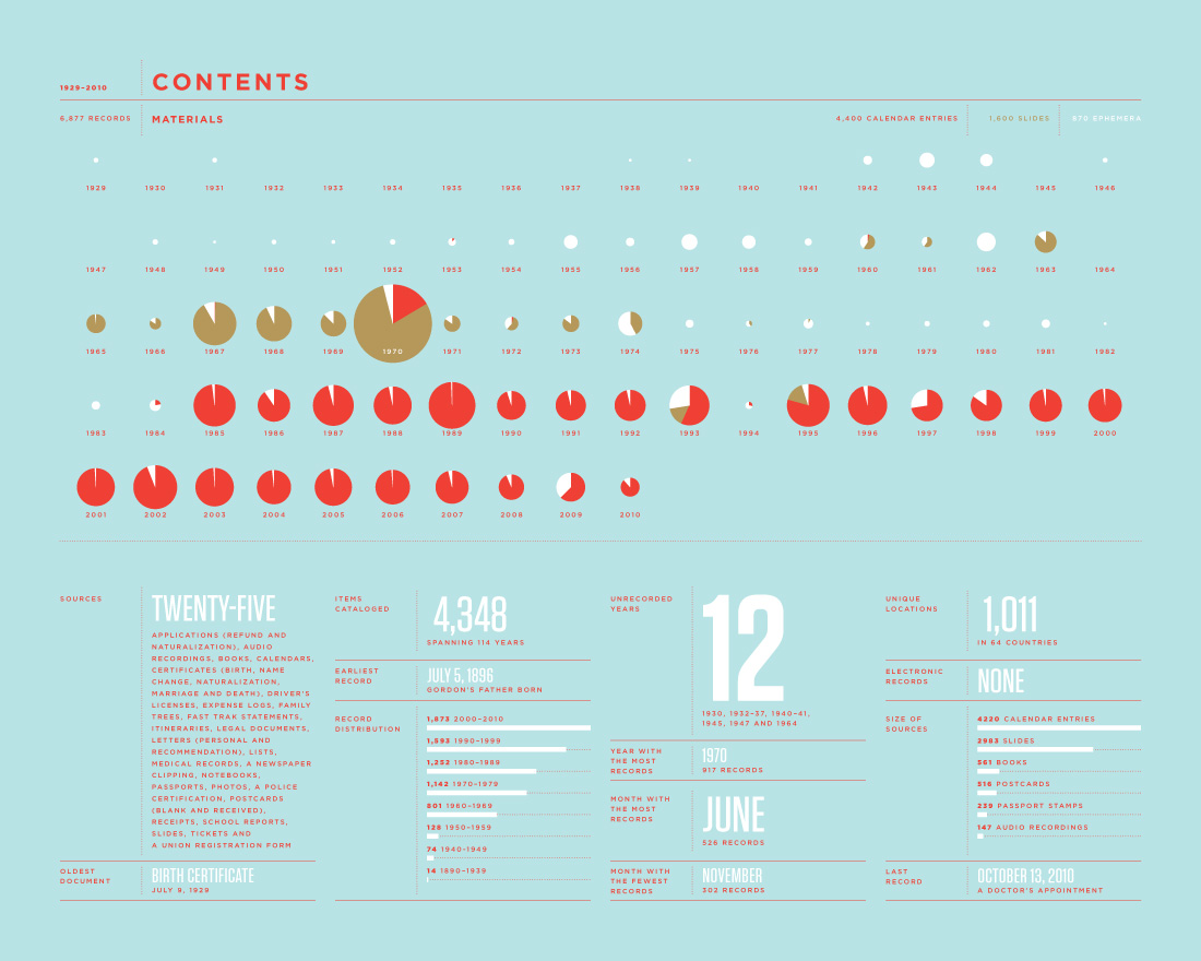
Interestingly, my dad has been to more countries, yet I doubt his experience would be as fun to tell.
The information presented is extremely straightforward. The pie charts do an excellent job of describing what sources were used to compile the report, when they were used, and the quantity from each year used. The pie charts only display three colors, which keeps it neat and concise. At the bottom are interesting factoids from the reports, such as total number of countries visited, number of years without records, the month with the most/least records, etc. My only complaint is with some of the pie charts. A few of them are so small, it’s difficult to get any information out of them. It would have helped to make them a little larger.
All in all, despite some horrifically bad infographs, the Feltron report is still interesting. Nicholas Felton seems to forget two very basic principle of compiling and displaying data (whether in writing, graphical presentations, speeches… pretty much displaying it in anyway): if it’s not relevant/doesn’t get the point across, don’t publish it; and, keep it both as clear and concise as possible. For example, what’s the point of the white lines on the cover of the 2010 report? It’s probably the most concise thing in that report, but it is not clear. This is something we as a class need to remember as we move forward and practice creating our own data sets.
Leave a Reply