
My First Attempt
My Second Attempt
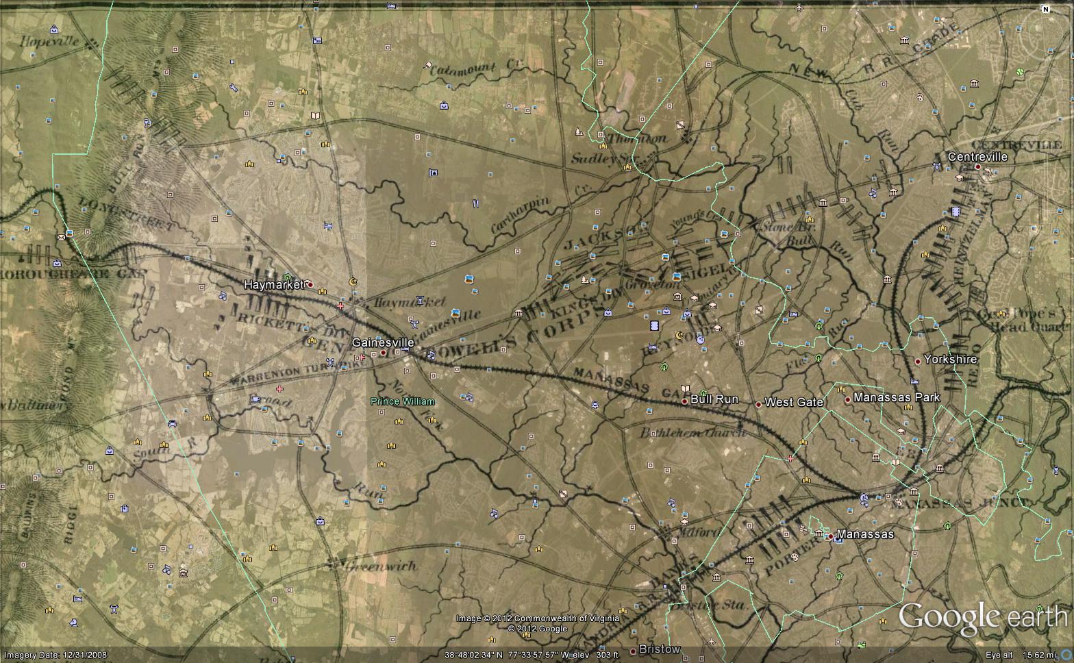
My first attempt was to show the troop positions of the 1st Battle of Manassas. However, this did not work very well. It seems that “drawn” maps simply aren’t as accurate as satellite maps. For example, I could not get Haymarket right and Centreville/Manassas. However, I had an idea. Perhaps a map that required such fine detail wasn’t practical for Google Earth’s overlay feature, but a map that showed more general, graphical information could be.
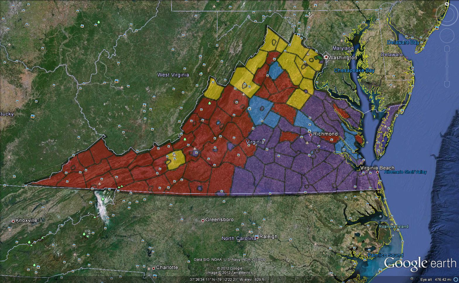
My second attempt went much better. Here is a visual representation of the ancestry of Virginians; Red is American, blue is English, Yellow is German, purple is African American, and green is Irish. Not everything could be precisely lined up; this was mostly due to intentional exagerations in size of some smaller counties/cities, such as Falls Church and Arlington. Yet this is less relavent, because the maps purpose is to give an overall feel of Virginian’s ancestry demographics. It’s not a house by house comparison, but a county by county.
Unfortunately, I’ve found that, unless a map is based on satellite imagery and exactly the same size as the geographic area involved, it is almost useless to try and use Google Earth’s overlay. Perhaps with some more practice my opinion will change though.
First map found here.
Second map found here.
Leave a Reply